Get Expert Insights on UI/UX Best Practices for Mobile Apps
UI/UX design plays a critical role in mobile app development. It not only impacts how users interact with your app but also influences engagement, retention, and conversion. Whether you're creating an iOS or Android application, implementing solid UI/UX principles is essential. Top developers like laxbyte coders emphasize thoughtful design as a foundation for successful apps. This blog explores modern UI/UX best practices, expert strategies, and real-world insights to help you build user-focused mobile experiences.
Why UI/UX Matters in Mobile App Development
- User Retention: A well-designed UI/UX keeps users engaged and encourages them to return.
- Reduced Development Cost: Investing in design early prevents costly rework later.
- Higher App Store Ratings: Users are more likely to give positive reviews to apps with intuitive navigation.
- Better Conversion Rates: Clear UI flows guide users toward desired actions (signup, purchase, etc.).
- Improved Brand Reputation: Visually appealing and functional apps reflect well on your brand.
Key UI/UX Design Principles for Mobile Apps
- Consistency: Maintain uniform design patterns, fonts, and layouts across the app.
- Simplicity: Avoid clutter and focus on core features with minimal distractions.
- Accessibility: Design for all users, including those with visual or physical impairments.
- Responsiveness: Ensure the UI adapts to different screen sizes and devices.
- Feedback: Provide visual and haptic feedback to acknowledge user actions.
- Familiarity: Use recognizable icons and gestures that align with Android and iOS guidelines.
Expert Mobile UI/UX Strategies from laxbyte coders
As a leading app development firm, laxbyte coders emphasizes the following expert strategies when designing mobile app experiences:
- Conduct user research and persona development before design begins.
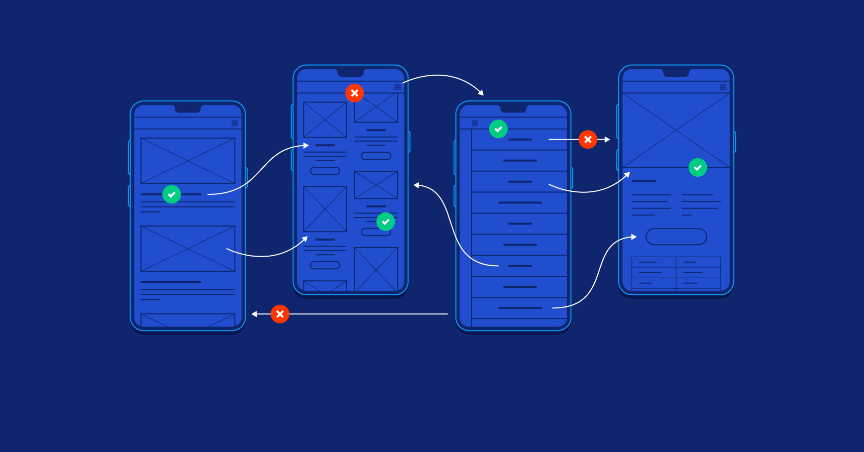
- Use wireframes and interactive prototypes to test design logic.
- Implement Bootstrap or similar responsive frameworks for flexible layouts.
- Follow platform-specific design guidelines (Material Design for Android, Human Interface Guidelines for iOS).
- Perform regular usability testing with real users.
- Utilize design systems to maintain UI consistency across modules.
Common UI/UX Mistakes to Avoid
- Overloading screens with information – Less is more in mobile design.
- Ignoring accessibility – Always include options like contrast modes, font scaling, and screen reader support.
- Slow loading times – Heavy graphics or poor code affect performance and user satisfaction.
- Unclear CTAs – Calls to action must be visible, simple, and predictable.
- Non-responsive layouts – Apps should look great on all screen sizes, including tablets.
Comparison Table: Android vs iOS UI Guidelines
| UI Element |
Android (Material Design) |
iOS (Human Interface Guidelines) |
laxbyte coders Approach |
| Navigation |
Navigation Drawer, Bottom Navigation |
Tab Bar, Navigation Bar |
Adaptive navigation for each OS |
| Typography |
Roboto Font |
San Francisco Font |
Follows native typography for platform familiarity |
| Icons |
Outlined, minimal icons |
Rounded, filled icons |
Uses platform-specific icon libraries |
| Gestures |
Swipe, long press, drag |
Swipe, force touch, tap |
Designs with intuitive gesture support |
| Animation |
Material motion guidelines |
Smooth transitions with minimal movement |
Implements subtle transitions to guide users |
Top Mobile UI/UX Tools Recommended by laxbyte coders
- Figma – For collaborative design and prototyping.
- Adobe XD – Excellent for wireframes, interactions, and animations.
- Sketch – Popular for macOS-based UI design.
- InVision – For sharing clickable prototypes and collecting feedback.
- Zeplin – Useful for developer handoff and design specs.
Tips to Improve Mobile App Usability
- Keep important actions within thumb zone reach.
- Use consistent and recognizable icons.
- Provide instant feedback on taps and interactions.
- Test designs in both light and dark modes.
- Design for offline usage where applicable.
How Bootstrap Helps in Responsive UI/UX Design
Bootstrap is one of the most effective frameworks for designing responsive mobile apps. It provides pre-built CSS classes and grid systems to streamline layout design. Here’s why laxbyte coders often use Bootstrap for hybrid and progressive web apps:
- Supports mobile-first design principles
- Built-in responsive grid and breakpoints
- Ready-to-use components like modals, buttons, and navbars
- Fast prototyping and clean UI structure
Conclusion
Building a successful mobile app is more than just writing code. It's about creating seamless, intuitive, and engaging experiences for your users. UI/UX design is a crucial component of this journey, and following the right best practices can significantly improve your app’s usability and market success.
Partnering with experienced developers like laxbyte coders ensures your app is not only technically sound but also designed for modern user expectations. From responsive layouts to personalized experiences, investing in quality UI/UX design is the smartest move for any business in 2025.
 Arvind Rajput


